Build a responsive accessible table
1 January 2021
How to build a responsive accessible table, only using HTML and CSS.
Tables on mobile are sometimes not very user-friendly. That might be because of horizontal scrolling, or you have had to resize content and hope it fits a 320px viewport.
The table
If you want to check out the HTML and CSS, you can view on Codepen, view on GitHub or view the example.
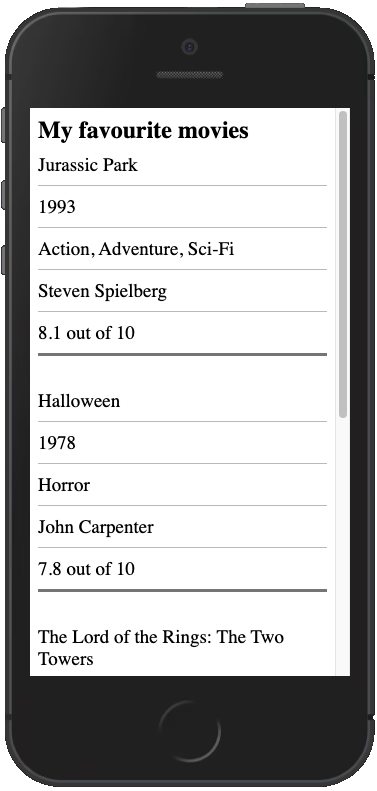
When viewed on a desktop, the table component will look like any other table. When viewed on a mobile, it collapses into a grouped list-style component. Even though the table has a completely different appearance, a screen reader will behave as if it was a normal table.
Though this is not without a possible flaw. If a user is a sighted screen reader user, then there could be some confusion as theyr navigation will not 100% match what they are seeing due to reading out table information which isn't there.
How it works
Let's start by building our barebones HTML table:
<table class="responsive-table">
  <caption>My favourite movies</caption>
  <thead>
    <tr>
      <th scope="col">Title</th>
      <th scope="col">Release year</th>
      <th scope="col">Genre</th>
      <th scope="col">Director</th>
      <th scope="col">IMDb rating</th>
    </tr>
  </thead>
  <tbody>
    <tr>
      <td>Jurassic Park</td>
      <td>1993</td>
      <td>Action, Adventure, Sci-Fi</td>
      <td>Steven Spielberg</td>
      <td>8.1 out of 10</td>
    </tr>
    <tr>
      <td>Halloween</td>
      <td>1978</td>
      <td>Horror</td>
      <td>John Carpenter</td>
      <td>7.8 out of 10</td>
    </tr>
    <tr>
      <td>The Lord of the Rings: The Two Towers</td>
      <td>2002</td>
      <td>Adventure</td>
      <td>Peter Jackson</td>
      <td>8.7 out of 10</td>
    </tr>
    <tr>
      <td>Anchorman: The Legend of Ron Burgundy</td>
      <td>2004</td>
      <td>Comedy</td>
      <td>Adam McKay</td>
      <td>7.2 out of 10</td>
    </tr>
  </tbody>
</table>
And some default CSS. Nothing special here, just adding a bit of padding and borders. So you can change it however you would like.
table {
  border-collapse: collapse;
  border-spacing: 0;
}

caption {
  font-size: 24px;
  font-weight: 700;
  text-align: left;
}

th {
  border-bottom: 1px solid #bfc1c3;
  font-size: 19px;
  padding: 0.5em 1em 0.5em 0;
  text-align: left;
}

td {
  border-bottom: 1px solid #bfc1c3;
  font-size: 19px;
  padding: 0.5em 1em 0.5em 0;
}
Now we have a standard table, the perfect starting point. We can now add our responsiveness.
On mobile, we are going to change our table rows to be block-level rather than their default table-row. That will break the alignment with the table heading, so we can visually hide the <thead>.
We do not use display: none to hide this as it needs to remain available for screen readers. Read more about visually hiding content
A media query is used to keep the <thead> as a table-row on a larger screen. If you want the table to go responsive at a different size, then you can change the media query to whatever is suitable for you. This example has the responsive view starting at 768px.
.responsive-table {
  margin-bottom: 0;
  width: 100%;
}

thead {
  border: 0;
  clip: rect(0 0 0 0);
  -webkit-clip-path: inset(50%);
  clip-path: inset(50%);
  height: 1px;
  margin: 0;
  overflow: hidden;
  padding: 0;
  position: absolute;
  white-space: nowrap;
  width: 1px;
}

tbody tr {
  display: block;
  margin-bottom: 1.5em;
  padding: 0 0.5em;
}

@media (min-width: 769px) {
  tbody tr {
    display: table-row;
  }
}
Now we need to get our mobile version to resemble a list. To do that, we add display: flex to the <td> elements (this will make more sense later on).
I add a border-bottom to the <tr>. I think it breaks things up a bit, but is entirely optional.
And then like we just did with the <thead> back to the default table-cell on a desktop.
tbody tr td {
  display: flex;
  justify-content: space-between;
  min-width: 1px;
  text-align: right;
}

@media (max-width: 768px) {
  tbody tr td {
    padding-right: 0;
  }
  tbody tr td:last-child {
    border-bottom: 0
  }
  tbody tr {
    border-bottom: 3px solid grey;
  }
}

@media (min-width: 769px) {
  tbody tr td {
    display: table-cell;
    text-align: left;
  }
}
We changed the display styling for <tr> and <td> which means a screen reader is no longer aware these are still table elements. To fix that we will use some HTML roles so that no matter what we do to these elements, a screen reader always recognises them as their default.
We will add role="row" to <tr> and role="cell" to <td> elements.
<tbody>
  <tr role="row">
    <td role="cell">Jurassic Park</td>
    <td role="cell">1993</td>
    <td role="cell">Action, Adventure, Sci-Fi</td>
    <td role="cell">Steven Spielberg</td>
    <td role="cell">8.1 out of 10</td>
  </tr>
  <tr role="row">
    <td role="cell">Halloween</td>
    <td role="cell">1978</td>
    <td role="cell">Horror</td>
    <td role="cell">John Carpenter</td>
    <td role="cell">7.8 out of 10</td>
  </tr>
  <tr role="row">
    <td role="cell">The Lord of the Rings: The Two Towers</td>
    <td role="cell">2002</td>
    <td role="cell">Adventure</td>
    <td role="cell">Peter Jackson</td>
    <td role="cell">8.7 out of 10</td>
  </tr>
  <tr role="row">
    <td role="cell">Anchorman: The Legend of Ron Burgundy</td>
    <td role="cell">2004</td>
    <td role="cell">Comedy</td>
    <td role="cell">Adam McKay</td>
    <td role="cell">7.2 out of 10</td>
  </tr>
</tbody>
At this stage it is looking quite good. We have the default table styling on large screens, and a collapsed list view on mobile.
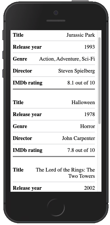
There is a problem though, the table headings are not visible because we hid the `thead`. Now we cannot tell what each cell represents anymore. We need bring those back on mobile.
<tbody>
  <tr role="row">
    <td role="cell">
      <span class="responsive-table__heading" aria-hidden="true">
        Title
      </span>
      Jurassic Park
    </td>
    <td role="cell">
      <span class="responsive-table__heading" aria-hidden="true">
        Release year
      </span>
      1993
    </td>
    <td role="cell">
      <span class="responsive-table__heading" aria-hidden="true">
        Genre
      </span>
      Action, Adventure, Sci-Fi
    </td>
    <td role="cell">
      <span class="responsive-table__heading" aria-hidden="true">
        Director
      </span>
      Steven Spielberg
    </td>
    <td role="cell">
      <span class="responsive-table__heading" aria-hidden="true">
        IMDb rating
      </span>
      8.1 out of 10
    </td>
  </tr>
  <tr role="row">
    <td role="cell">
      <span class="responsive-table__heading" aria-hidden="true">
        Title
      </span>
      Halloween
    </td>
    <td role="cell">
      <span class="responsive-table__heading" aria-hidden="true">
        Release year
      </span>
      1978
    </td>
    <td role="cell">
      <span class="responsive-table__heading" aria-hidden="true">
        Genre
      </span>
      Horror
    </td>
    <td role="cell">
      <span class="responsive-table__heading" aria-hidden="true">
        Director
      </span>
      John Carpenter
    </td>
    <td role="cell">
      <span class="responsive-table__heading" aria-hidden="true">
        IMDb rating
      </span>
      7.8 out of 10
    </td>
  </tr>
  <tr role="row">
    <td role="cell">
      <span class="responsive-table__heading" aria-hidden="true">
        Title
      </span>
      The Lord of the Rings: The Two Towers
    </td>
    <td role="cell">
      <span class="responsive-table__heading" aria-hidden="true">
        Release year
      </span>
      2002
    </td>
    <td role="cell">
      <span class="responsive-table__heading" aria-hidden="true">
        Genre
      </span>
      Adventure
    </td>
    <td role="cell">
      <span class="responsive-table__heading" aria-hidden="true">
        Director
      </span>
      Peter Jackson
    </td>
    <td role="cell">
      <span class="responsive-table__heading" aria-hidden="true">IMDb rating</span>
      8.7 out of 10
    </td>
  </tr>
  <tr role="row">
    <td role="cell">
      <span class="responsive-table__heading" aria-hidden="true">
        Title
      </span>
      Anchorman: The Legend of Ron Burgundy
    </td>
    <td role="cell">
      <span class="responsive-table__heading" aria-hidden="true">
        Release year
      </span>
        2004
    </td>
    <td role="cell">
      <span class="responsive-table__heading" aria-hidden="true">
        Genre
      </span>
      Comedy
    </td>
    <td role="cell">
      <span class="responsive-table__heading" aria-hidden="true">
        Director
      </span>
      Adam McKay
    </td>
    <td role="cell">
      <span class="responsive-table__heading" aria-hidden="true">
        IMDb rating
      </span>
      7.2 out of 10
    </td>
  </tr>
</tbody>
The CSS to go with it:
.responsive-table__heading {
  font-weight: 700;
  padding-right: 1em;
  text-align: left;
  word-break: initial;
}
@media (min-width: 769px) {
  .responsive-table__heading {
    display: none;
  }
}
That looks like a lot of extra HTML, but I will explain.
We added a <span> which which is identical to the heading for that data, then with the use of aria-hidden="true" we hid that from a screen reader. This is because the <thead> is still fully functional so the <span> gives us a visual data representation on mobile. The CSS hides and shows it depending on mobile or desktop.
Remember that flex we used before? Now it is even more useful by adding justify-content: space-between which means we can separate the mobile visual heading with the data counterpart.
There we have it. A finished responsive and accessible table only using HTML and CSS.
An issue you may find with this specific style of table, is that on a mobile device it can be more difficult to compare pieces of data between rows and columns. Keep that in mind if it is vital that users can quickly compare pieces of data such as monthly outgoings in a transactional table.